At Sleeper, we are constantly looking for ways to improve the design and usability of both our mobile and web apps.
At Sleeper, we are constantly looking for ways to improve the design and usability of both our mobile and web apps.
This blog post details some upcoming changes to the user interface, as well as the thought process behind it.
Navigation
Last season, we made a major announcement. Sleeper officially launched season-long fantasy football leagues, a direct competitor to ESPN and Yahoo!’s commissioner platforms.
This meant that our app had a lot more functionality than before, and we needed to categorize it in a way that new members can easily identify different sections of the app.
At the time, we had a side drawer navigation that was starting to get cluttered with more features being added each season.
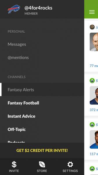
In an effort to declutter the interface and make sections easier to explore, we introduced bottom tabbed navigation for the following major sections — Leagues, Messages, Channels, Scores, and Profile.
Initially, it seemed that our hypothesis around ease of understanding was correct, particularly for first time users.
Bottom-tabbed navigation made it very obvious what the features were, and new members explored more features in their first day than in previous iterations of the product.
However, after a few weeks went by, complaints about the interface slowly trickled in, mostly coming from long-time users of the app. The feedback was that they preferred the previous drawer navigation, as it was familiar and easier to use for them.
While we did increase clarity in the first time user experience, it seemed that the app was not as friendly for users who were using the app multiple times a day. This is something that is a lot harder to measure before launching a redesign. While retention numbers didn’t change much for us overall, we ourselves found the app tedious to navigate for some core use cases. The end result that in our effort to optimize for first-time use case, we had degraded the repeat user experience.
Here are a few examples of use cases that became more tedious with the redesign.
- A user who wants to quickly flip back between their fantasy matchup screen and live box scores.
- Responding to direct messages from leaguemates (typically to discuss a trade) without having to “exit” the league.
- Sending trade messages directly from within the league, instead of having to go to messages section and autocompleting their name from memory.
- Chatting with other members in a channel, and being quickly be able to see scores, play by plays, and player rankings without having to leave the chat.
For these reasons, we are bringing back a new and improved version of the drawer navigation.
For long-time members, you will be immediately familiar with the new navigation. For new members who were here for less than a year, you’ll get a glimpse of what made the interface special to long-time users.
Here’s a quick sneak peek:
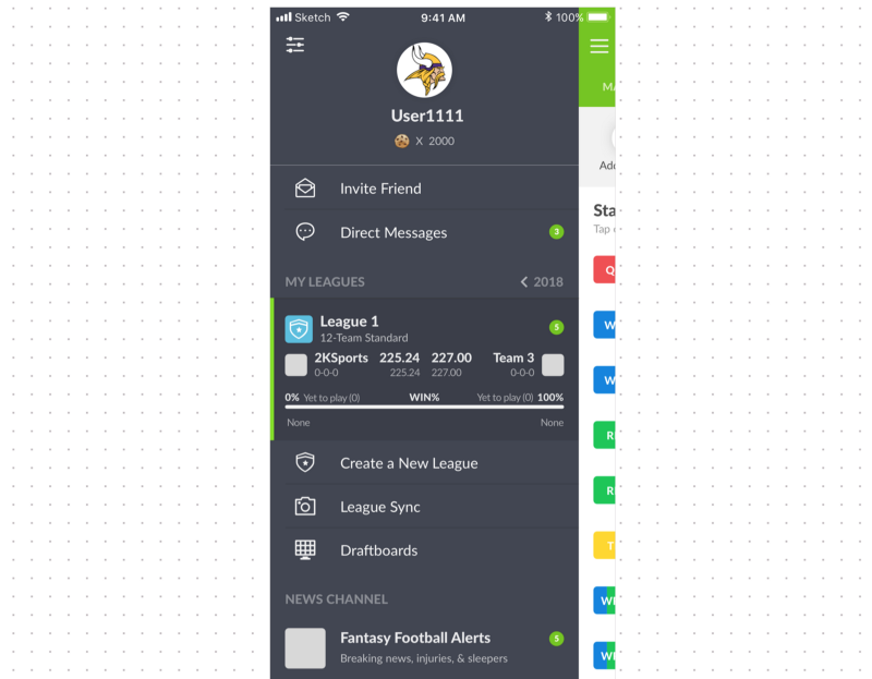
Here’s a screenshot of what you can expect on the right side drawer:
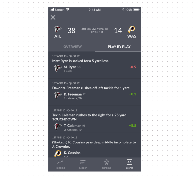
If you are an Android user, you may remember that the side panel drawer navigation was not very responsive to touch 2 years ago. Rest assured that this has been fixed. Gestures are now responsive and smooth on all devices as part of this redesign.
Color
We’re also making changes to the app’s color palette to make the interface easier on your eyes.
This is especially important for league users who spend over an hour per day staring at roster, matchup, and research screens.
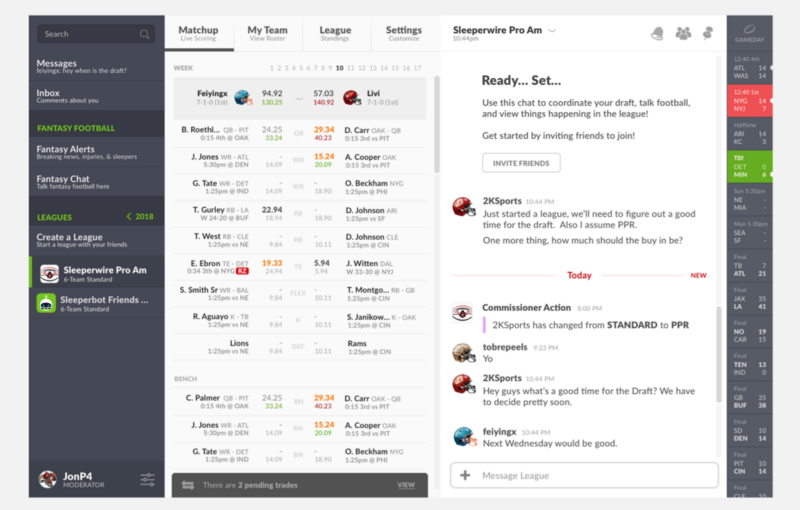
On the roadmap a bit later is also a night theme that will sync with your local sunrise and sunset times.
Research Center
Whether you play in Sleeper leagues or are using Sleeper for research and information purposes, you will be happy to know that a lot of effort has gone into research panels that can be quickly accessed from anywhere in the app.
Based on feedback from last year, our player research and player cards could benefit from design and information changes.
Our goal was not just to make things better, but to become the standard for player information and research in terms of both the user interface and also information available.
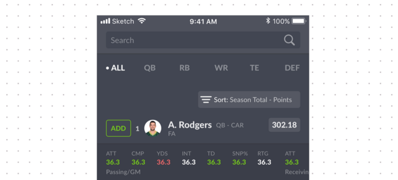
The redesign is the first step in achieving this goal, and we will continue adding to the research center throughout the offseason.
When is the redesign coming?
We expect that the redesign will be rolled out to everyone in late June.
There are a couple other announcements related to the redesign that we can’t wait to share with you as well.
Stay tuned!

