Unveiling a new Sleeper logo to kickoff our exciting brand refresh
Sleeper logo exploration
Today, we're excited to unveil Sleeper's new logo, marking the start of an exciting brand refresh. While we’ve cherished our old logo, it’s time to share why we decided to evolve it.
This change isn’t just for the sake of change. A logo update is only necessary when it no longer serves its purpose effectively.
Our original logo, crafted before Sleeper launched, was playful and unique, capturing the essence of fantasy football. However, any deviation—whether in color, angle, or context—made it look off.

Another issue we struggled with is using the Sleeper logo with non-football sports.
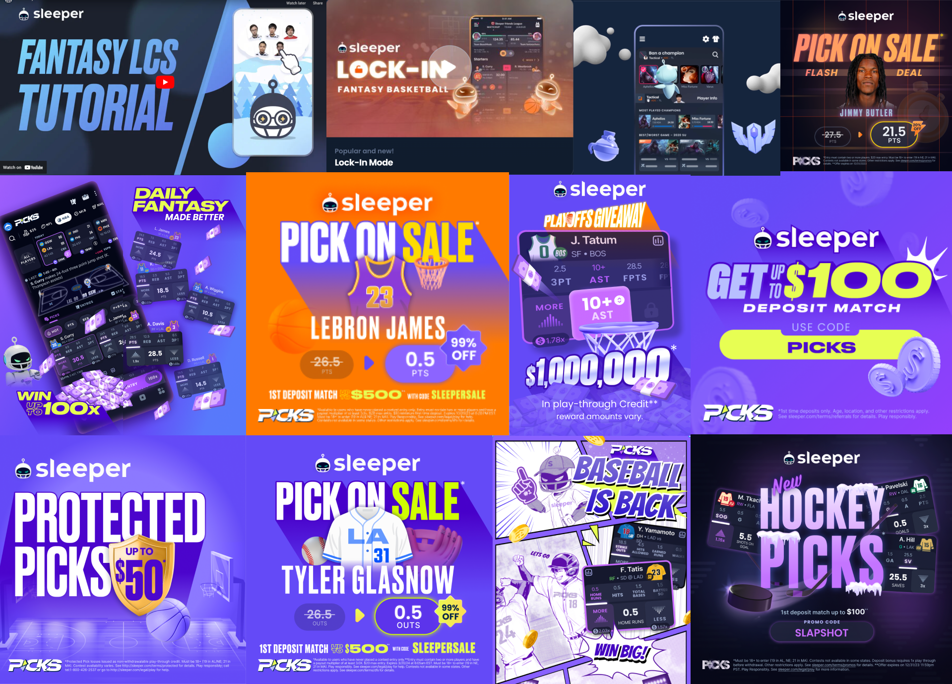
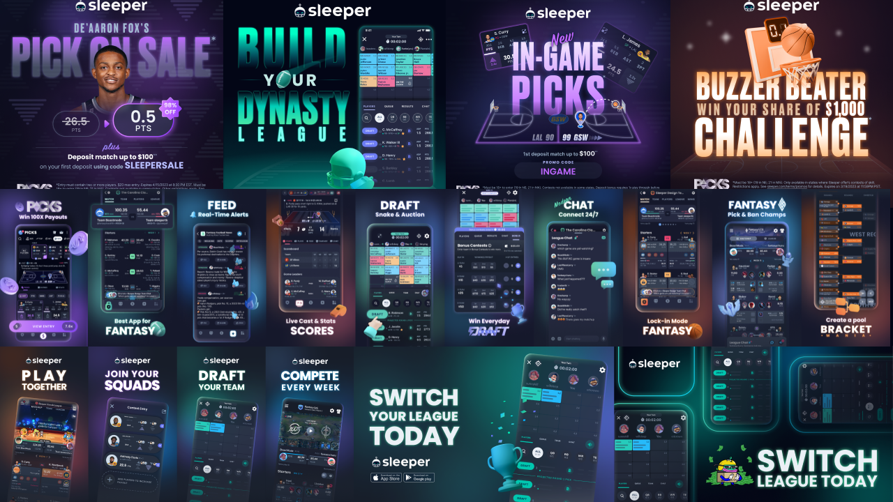
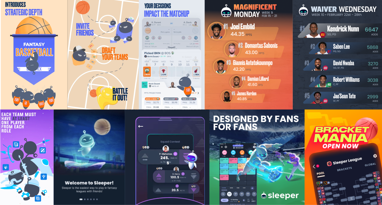
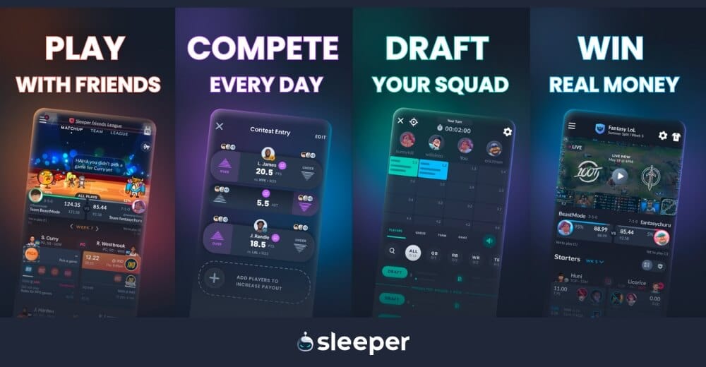
To address these inconsistencies, we created different versions of the logo for various uses. While this approach helped, it led to a lack of cohesion. Each app icon looked different, and none matched the logo perfectly.
Wearing a football helmet to play a basketball game? Confusing!

Although each logo had its own charm, the overall lack of cohesion was evident. A strong brand requires instant recognition, no matter where it’s seen.
Instead, we had this:

Cute, but not cohesive.
SleeperBot was originally inspired by a football helmet, limiting our ability to expand into a broader range of sports.
Our new logo hopes to retain the playful nature of the previous design, while marking our evolution beyond a single sport.
We wanted to do this in a way that preserves our identity and make it simple for existing users to recognize that it is still Sleeper.
Thus, the new SleeperBot is simply the same character, but free from the helmet. Also revealed is SleeperBot’s new hairstyle in the shape of an “S”.
New Sleeper logo
We won’t dive into the intricate design details and the significance of each curve and color—you’ve got things to do, and our primary goal here is to inform you about the change. You’ll notice that the icons on your devices will soon look a bit different. But don’t worry, they’ll still feel reassuringly familiar.
In the coming months, you’ll see this new visual direction across all our touch-points: on our website, in advertising, and even within the product itself (without interrupting your Sleeper experience, of course). We’re still Sleeper, but now with a more consistent and instantly meaningful and memorable identity.
Stay tuned for more updates as we continue to evolve and improve our brand. Thank you for being part of this journey with us.


